EasyUI
MenuButton
Extend from $.fn.linkbutton.defaults. Override defaults with $.fn.menubutton.defaults.
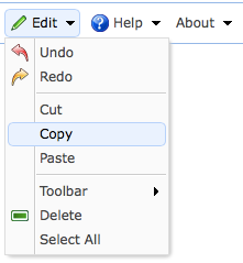
The menubutton is the part of drop-down menu. It is associated with a linkbutton and menu. The linkbutton is displayed while the menu is hidden. When users click or move the mouse over the linkbutton, the menu will show to allow to click on it.

Dependencies
- menu
- linkbutton
Usage
Usually the menubutton is created declaratively from markup.
Create menubutton using javascript.
Properties
The properties extend from linkbutton, below is the added properties for menubutton.
| Name | Type | Description | Default |
|---|---|---|---|
| plain | boolean | True to show plain effect. | true |
| menu | string | A selector to create a corresponding menu. | null |
| menuAlign | string | The alignment of top level menu. Possible values are: 'left', 'right'. Available since version 1.3.6. | left |
| duration | number | Defines duration time in milliseconds to show menu when hovering the button. | 100 |
| showEvent | string | The event that cause the menu to appear. Available since version 1.5.5. | mouseenter |
| hideEvent | string | The event that cause the menu to disappear. Available since version 1.5.5. | mouseleave |
| hasDownArrow | boolean | Defines if to display the down arrow icon. Available since version 1.4.2. | true |
Methods
The methods extend from linkbutton, below is the added or overridden methods for menubutton.
| Name | Parameter | Description |
|---|---|---|
| options | none | Return the options object. |
| disable | none | Disable the menubutton. |
| enable | none | Enable the menubutton. |
| destroy | none | Destroy the menubutton. |
