DataList
Extend from $.fn.datagrid.defaults. Override defaults with $.fn.datalist.defaults.
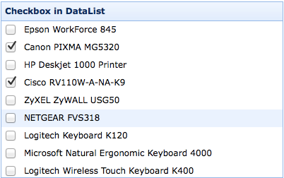
The datalist renders items in a list. It is a special datagrid that displays data in one column. You can define the column format and style for each rows.
Dependencies
- datagrid
Usage Example
Create datalist from markup.
Create datalist using javascript.
Properties
The properties extend from datagrid, below is the added properties for datalist.
| Name | Type | Description | Default |
|---|---|---|---|
| lines | boolean | Defines if to display the row lines. | false |
| checkbox | boolean | Defines if to display checkbox for each rows. | false |
| valueField | string | The field value name to bind to the row. | value |
| textField | string | The field name to display on the row. | text |
| groupField | string | Indicate what field to be grouped. | |
| textFormatter | function(value,row,index) |
The text field formater function, takes three parameters: value: the field value. row: the row record data. index: the row index. |
|
| groupFormatter | function(value,rows) |
The formatter function to return the group content, takes two parameters: value: the group value defined by 'groupField' property. rows: the data rows according to the specified group value. |
Events
The events extend from datagrid.
Methods
The methods extend from datagrid.