ComboTreeGrid
Extend from $.fn.combo.defaults and $.fn.treegrid.defaults. Override defaults with $.fn.combotreegrid.defaults.
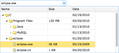
The combotreegrid combines the selection control with drop-down treegrid. It enables the user to find and select a value quickly from the treegrid. The combotreegrid supports a treegrid with tree-state checkboxes for convenient multiple selection.
Dependencies
- combo
- treegrid
Usage Example
Create ComboTreeGrid
1. Create a combotreegrid from markup.
2. The combotreegrid can be created from existing <select> or <input> element using javascript.
Properties
The properties extend from combo and treegrid, below is the added or overridden properties for combotreegrid.
| Name | Type | Description | Default |
|---|---|---|---|
| idField | string | The id field name. | null |
| treeField | string | The tree node field to be displayed in textbox. | null |
| textField | string | The underlying data field name to bind to this ComboTreeGrid. Available since version 1.5.2. | null |
| limitToGrid | boolean | Limit the inputed values to the listed grid rows. | false |
Events
The events extend from combo and treegrid.
Methods
The methods extend from combo, below is the added or overridden methods for combotreegrid.
| Name | Parameter | Description |
|---|---|---|
| options | none | Return the options object. |
| grid | none |
Return the treegrid object.
The example below shows how to get the selected row:
var g = $('#cc').combotreegrid('grid');	// get treegrid object
var r = g.treegrid('getSelected');	// get the selected row
alert(r.name);
|
| setValue | value |
Set the component value.
Code example:
$('#cc').combotreegrid('setValue', '002');
$('#cc').combotreegrid('setValue', {id:'003',name:'name003'});
|
| setValues | values |
Set the component value array.
Code example:
$('#cc').combotreegrid('setValues', ['001','007']);
$('#cc').combotreegrid('setValues', ['001','007',{id:'008',name:'name008'}]);
|
| clear | none | Clear the component value. |