CheckBox
Override defaults with $.fn.checkbox.defaults.
Dependencies
- none
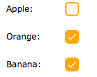
Usage
Create checkbox from markup.
Create checkbox using javascript.
Properties
| Name | Type | Description | Default |
|---|---|---|---|
| width | number | The width of checkbox component. | 20 |
| height | number | The height of checkbox component. | 20 |
| value | string | The default value bound to the checkbox. | null |
| checked | boolean | Defines if the checkbox is checked. | false |
| disabled | boolean | Defines if to disable the checkbox. | false |
| label | string | The label bound to the checkbox. | null |
| labelWidth | number | The label width. | auto |
| labelPosition | string | The label position. Possible values are:'before','after','top'. | before |
| labelAlign | string | The label alignment. Possible values are:'left','right'. | left |
Events
| Name | Parameters | Description |
|---|---|---|
| onChange | checked | Fires when the checked value is changed. |
Methods
| Name | Parameter | Description |
|---|---|---|
| options | none | Return the options object. |
| setValue | value | Set the value for the checkbox. |
| disable | none | Disable the component. |
| enable | none | Enable the component. |
| check | none | Check the component. |
| uncheck | none | Uncheck the component. |
| clear | none | Clear the 'checked' value. |
| reset | none | Reset the 'checked' value. |